Check out the working file in Creatie here
Role: Lead Designer
Industry: UX/Technology
Duration: 2 weeks
Project Overview
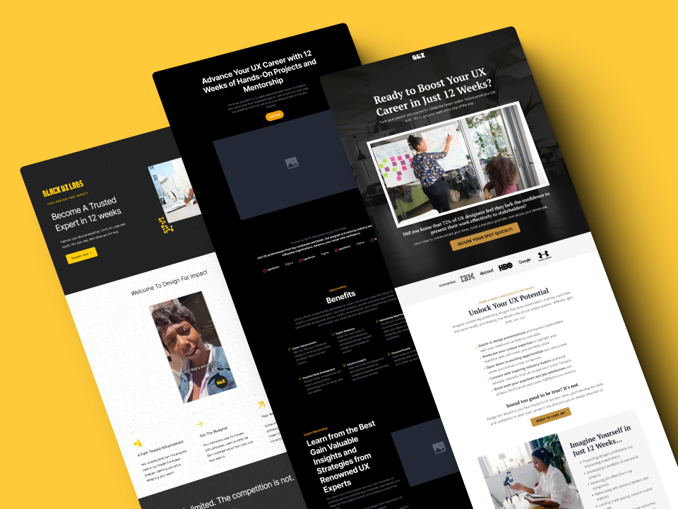
Design for Impact, created by Amber Fields, is a coaching program designed to help UX professionals, especially those from underrepresented communities, sharpen their skills and make lasting contributions in their workplaces. My goal was to redesign the landing page to not only boost conversions but also justify Amber’s decision to raise the program’s price by five times.
The original micro-site, built on Carrd, was functional but lacked depth and engagement. It didn’t tell the story that would compel visitors to take action. My job was to turn that around and create a landing page that effectively communicated the value of the program while making it clear why this program deserved a premium price tag.
The Mission
The Design for Impact program isn’t just another coaching experience. Amber’s approach goes beyond the technical side of UX—she teaches professionals how to drive change, lead with influence, and use their diverse perspectives as a strength. The new landing page needed to reflect all of that, making it clear why investing in this program would be transformative for the audience.
My Role
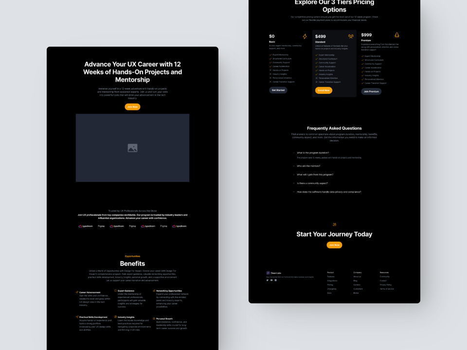
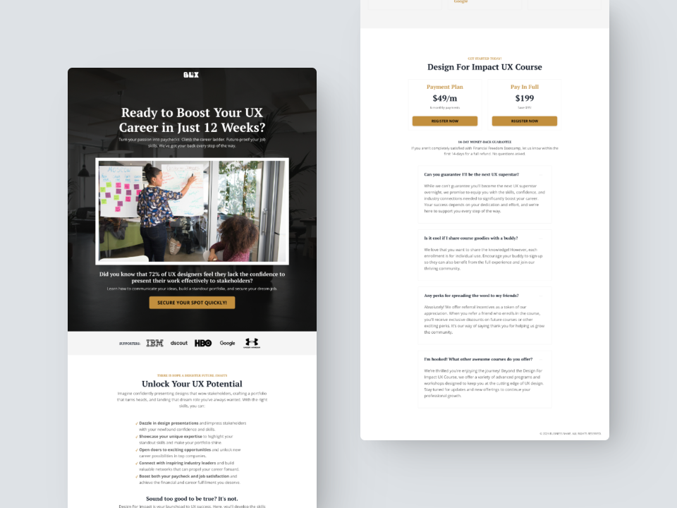
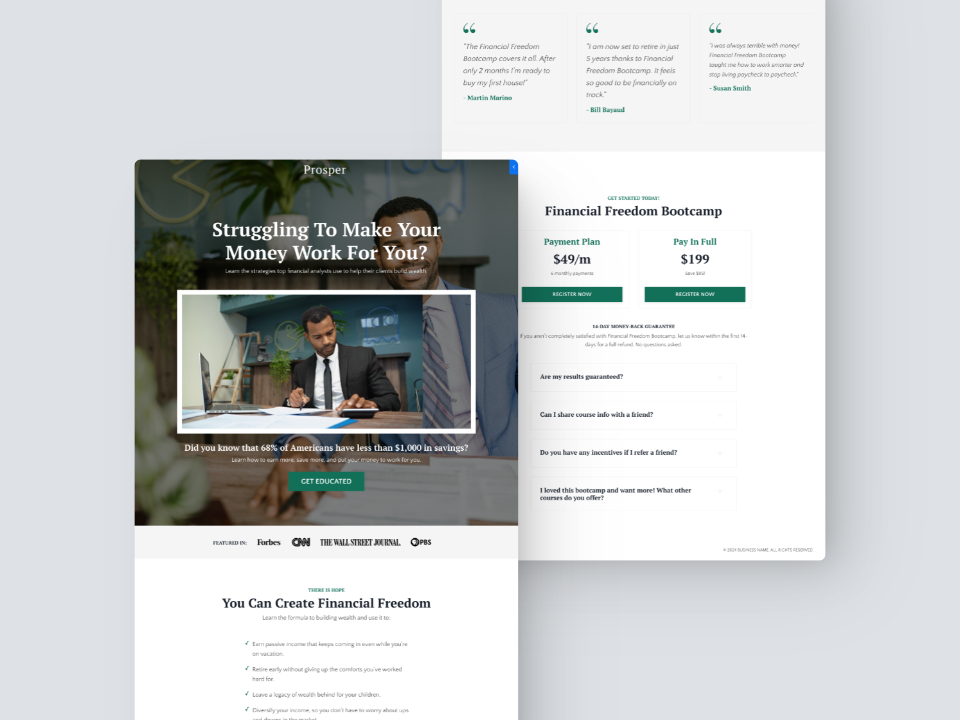
As Lead Designer, I took charge of creating a landing page that not only resonated with Amber’s audience but also captured the full scope of what the program had to offer. Working within Kajabi, a platform I hadn’t used before, I customized templates and layouts to fit Amber’s brand. The focus was on user experience and storytelling—crafting a narrative that spoke directly to UX professionals of color and motivated them to sign up.
Process and Execution
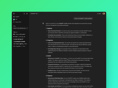
After several conversations with Amber, I honed in on the key messages her audience needed to hear. I used ChatGPT to help draft microcopy that stayed true to her voice while addressing the specific challenges and goals of her community. This content-driven approach shaped the entire design.
Visually, I focused on creating a clean, intuitive layout that would make it easy for potential participants to navigate and absorb the program’s value. Although I was new to Kajabi, I adapted quickly, tweaking the CSS and customizing the design to ensure the page felt cohesive and aligned with Amber’s vision.
Ethical Design Considerations
Given the focus on diversity and inclusion in the Design for Impact program, it was crucial that the site reflected those values. The imagery, language, and overall tone were carefully chosen to create a welcoming and inclusive space for professionals from underrepresented groups. Every design decision was intentional, ensuring the site communicated equity and empowerment.
Collaboration
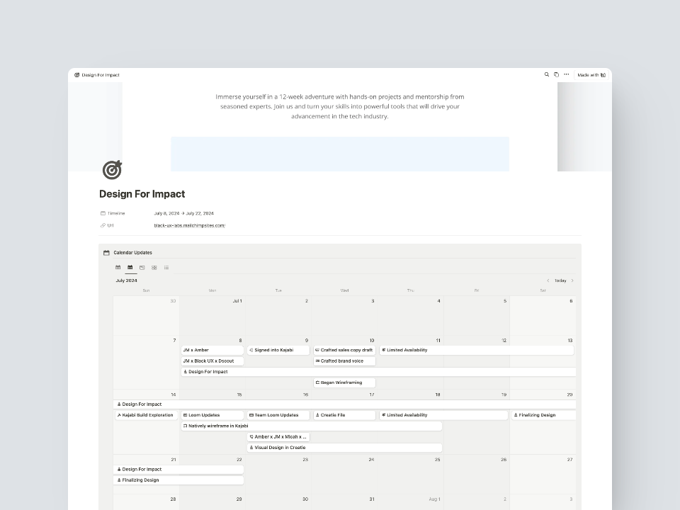
Amber gave me the freedom to lead the project with full creative autonomy. We kept communication clear and regular through Slack and Loom, using check-ins to make sure we were aligned at every stage. My Notion dashboard helped us stay organized, tracking milestones and progress throughout the project.
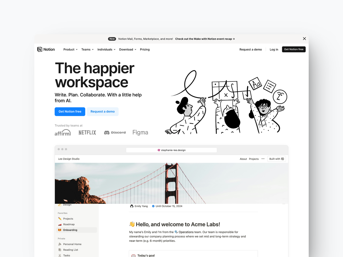
Check out this post that covers how I use Notion to manage projects
Results and Impact
The redesigned landing page accomplished what we set out to do:
- Price Increase: Amber confidently raised the price of her program by 5x, a strong signal that the page successfully conveyed the value of Design for Impact.
- Cohort Sign-Ups: Although Black UX Labs paused operations shortly after the redesign, early results showed a boost in interest and sign-ups for the next cohort. Long-term metrics couldn’t be tracked due to the project being put on hold, but initial feedback confirmed that the redesign had a positive impact.
Challenges and Growth
Navigating Kajabi: I was new to the platform, but I adapted quickly. I focused on customizing the templates to fit Amber’s goals, ultimately delivering a high-quality result despite the steep learning curve.
Learning from Experience: Coming off my previous project with HelpfulHand AI, I applied lessons in user engagement and the use of AI tools to enhance the landing page for Design for Impact. This cross-project insight allowed me to move quickly without compromising on quality.
Next Steps
With Black UX Labs currently on hold, we’ll resume tracking user engagement and conversion metrics once operations restart. However, the foundation is set. The redesigned landing page is ready to support future cohorts, and it’s positioned to drive even greater results when the program picks back up.



Comments