🔍 Overview
Helpful Hand AI was a mission-driven prototype created to support overlooked job seekers—especially Black and Brown technologists affected by mass layoffs—in finding meaningful work through skill-first, emotionally intelligent job matching.
The product didn’t just aim to show listings. It was built to see people—to surface gigs, roles, and side hustles that reflected what users could do, not just what was on their resumes. Think: a UX designer who also DJs getting matched to tech event gigs.
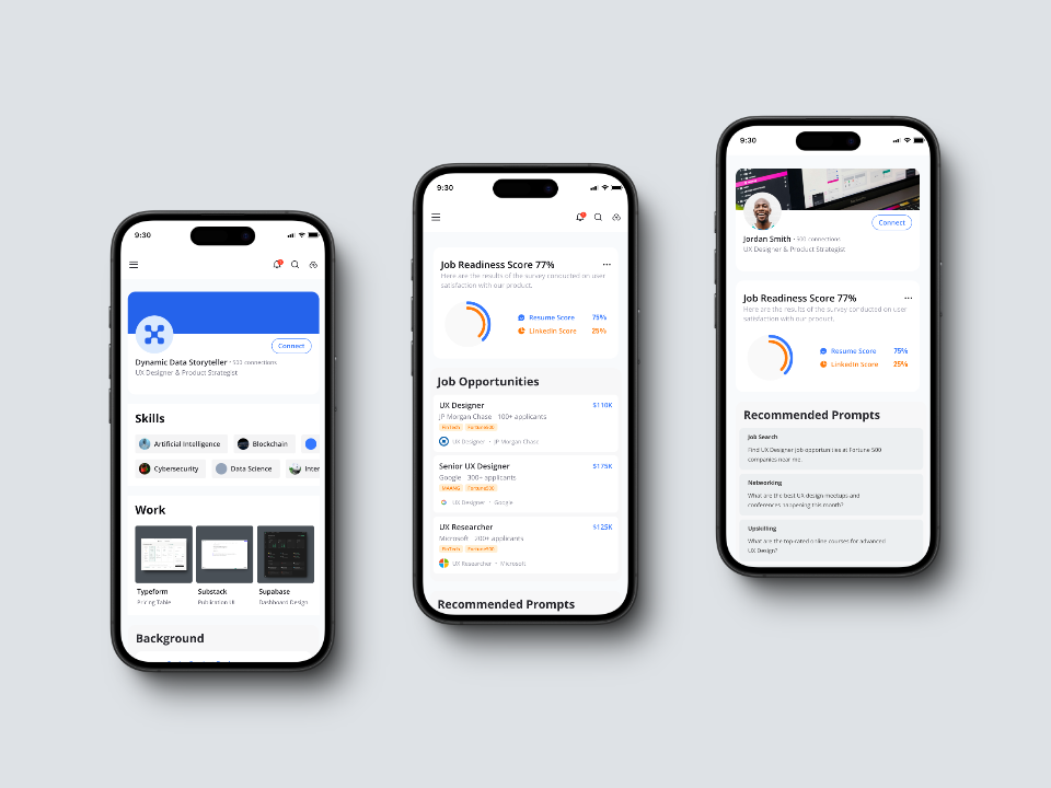
I led a two-week, AI-powered sprint to rethink the product’s onboarding experience, overall UX, and emotional flow—working solo across strategy, research, UX, and interface design.
🧭 The Backstory
This project came through my engagement with Black UX Labs, a coaching program supporting emerging Black and Brown design leaders. It wasn’t a traditional engagement—I offered design services in exchange for program access.
The prototype’s founder had a compelling vision but limited resources. So we ran a lean, high-autonomy sprint to push the product further and test how far AI-accelerated workflows could take us.
🧱 The Original Prototype
The initial product featured:
- A 5-step onboarding flow with dense copy and form overload
- Resume upload + a “Job Readiness Score”
- A cluttered UI built in Bubble.io
- No mobile optimization—even though most users relied on phones
As someone who tested the prototype firsthand, I immediately recognized critical heuristic flaws. The experience didn’t reflect the needs, bandwidth, or emotional state of the target users. It created friction, not momentum.
🔬 Collaborating with Research
The team had gathered data via Dscout, but most of the findings simply confirmed what I already knew:
- Wordy copy confused people
- Visual hierarchy was poor
- CTAs weren’t clear or actionable
"Research is most valuable when it reveals nuance—not just what’s broken."
What mattered more was what the research hinted at:
- Users felt uneasy about job listings that “didn’t feel real”
- People didn’t know what to do after viewing a role
- The Readiness Score felt confusing rather than empowering
- Emotional signals—not just usability—needed redesign
I realized the real opportunity wasn’t to validate—it was to reframe the product around emotional clarity and user cognition.
🔄 The Mid-Sprint Pivot
Originally, I designed for desktop based on the team’s wireframes. But mid-sprint, we pivoted fully to mobile-first, realizing that most of our users lived on their phones.
I quickly adapted, rebuilding every screen and interaction with thumb-friendly targets, reduced copy, and async UX principles. That pivot turned out to be mission-aligned—meeting users where they already were, not where tech typically assumes they are.
✨ My Redesign Strategy
The goal was to make the platform usable, intuitive, and emotionally safe—especially for users with low bandwidth, limited digital literacy, or non-linear career paths.
Core Design Principles:
- Mobile-first UX → Large touch targets, minimal inputs, async-ready
- Reduced cognitive load → Clear language, fewer decisions, clean visual hierarchy
- Progressive disclosure → Let users focus on one task at a time
- Skill-first framing → Users share what they can do, not just where they’ve been
I also built asynchronous feedback systems in Notion and Figma, and used GPT to close creative loops and generate clarity when real-time feedback wasn’t possible.
⚙️ How I Used AI in the Sprint
At the time, I used Creatie’s Wizard tool to pull in UI components quickly. Combined with:
- My Figma design system
- GPT for feedback loop simulations
- AI-assisted synthesis of Dscout data
I was able to design, test, and polish a full mobile-first flow—twice, due to the pivot—in under two weeks.
🧪 What I’d Do Differently Today
If I were running this sprint now, I’d use Orb (natural language → UI) and Sentinel-16 (my custom GPT strategist) to run a tight 4-day flow:
| Day | Focus | Outcome |
|---|---|---|
| 1 | Empathize & Define | Research synthesis + AI-prioritized user needs |
| 2 | Ideate via Orb | First-pass flows generated via prompt tuning |
| 3 | Prototype in Figma | High-fidelity, emotionally guided UI |
| 4 | Validate or Handoff | Clickable prototype or dev-ready flows |
"Fast doesn’t have to mean hollow. You can build clarity in a week. Meaning, however, takes reflection."
🧠 What I Learned
- 🛠 You can build something real in 2 weeks→ Especially with lean systems, clarity, and the right tooling
- 🤖 AI doesn’t replace intuition—it amplifies it→ I used GPT to generate flows, simulate feedback, and reflect in real time
- 🧭 Heuristics show the cracks; research shows the soul→ Most usability flaws were predictable. Real insight came from emotions and moments of pause
- 🧱 Function ≠ trust→ Just because something “works” doesn’t mean people trust it—or want to keep using it
🔭 What This Project Represents
Helpful Hand AI is a turning point in my practice. It reflects how I approach product design today:
- Purpose-driven
- Emotionally attuned
- Strategically lean
- Technically adaptive
"I'm not just an innovator—I innovate with cause. Every project I touch is grounded in a deeper human story. I don't just build flows. I build pathways that restore dignity and unlock clarity."
🛠 Tools Used
- Figma → Mobile-first design system
- Notion → Async feedback and collaboration
- GPT (Sentinel-16) → Synthesis, critique, reflection
- Creatie (Wizard) → Component injection + rapid layout
- Dscout → Qualitative research input


