Overview
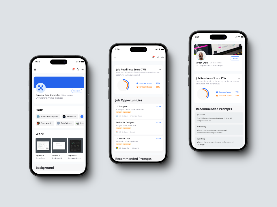
Helpful Hand AI was a mission-driven internal product aimed at empowering marginalized job seekers by matching them with both conventional and unorthodox opportunities — such as gigs aligned with their creative talents or side hustles (e.g., a UX designer who DJs getting matched with tech event gigs).
This wasn’t just about building another job platform — it was about reimagining employment access from a skill-first, human-centered lens. My role was to lead a fast-moving, two-week sprint to reimagine the onboarding flow and overall experience using AI-accelerated design workflows.
The Backstory
This project came through a coaching program I was part of, focused on uplifting Black and Brown UX leaders. It wasn’t a traditional engagement — we bartered skills: I offered product design services in exchange for access to the program. The founder of the company wanted to take a prototype further, but had limited funds, so this became a lean, AI-powered sprint to test what was possible.
The mission deeply resonated with me: build a tool that helps people be seen for what they can do — not just who they are on paper. That meant redesigning the platform to be more intuitive, mobile-accessible, and emotionally intelligent.
The Original Concept & Prototype
The initial prototype had a five-step onboarding flow with long-winded copy, dense forms, and a clunky UI built in Bubble.io. The core flow involved uploading a resume, receiving a "Job Readiness Score," and being matched with job opportunities.
While well-intentioned, the experience created cognitive friction. The UI was cluttered, slow, and didn’t align with the visual literacy or bandwidth constraints of the target users — many of whom rely exclusively on mobile internet. Plus, as someone who tested the early prototype myself, I could immediately identify heuristic flaws — it was clear what needed fixing.
Collaborating with Researchers
There was significant research already being conducted through Dscout. But here's the catch: the research mostly validated what I already knew. The friction points surfaced during testing were things I had already spotted — wordy flows, poor hierarchy, lack of clarity.
What this taught me: user research is only as valuable as the depth of insight it uncovers. If you’re testing a prototype that already violates UX heuristics, users will struggle — but that doesn’t tell you anything new. Research is most useful when it's focused on nuance: how people feel, where they pause, what assumptions they make. That became a big part of how I approach design moving forward.
My Redesign Strategy
The main goal was to simplify and clarify — especially for users with low bandwidth or low digital literacy. I trimmed the flow from five screens down to two, reduced visual clutter, removed jargon, and refocused the UI around clarity and progress.
The redesign emphasized:
- Mobile-first UX — large touch targets, high contrast, minimal typing
- Reduced cognitive load — plain language, minimal form fields
- Progressive disclosure — guiding users step-by-step without overwhelm
- Skill-first framing — focusing on what users can do, not what their resume says
I also leaned on research-backed principles of inclusive UX — like chunking content, visual cues, and supporting asynchronous use.
How I Used AI in the Design Process
At the time, I was using the Wizard tool in Creatie — not the Orb tool, which didn’t exist yet. The Wizard allowed me to search and place components directly into my canvas using a smart selection modal. This massively accelerated my process.
Combined with my personal Figma design systems and heuristic knowledge, I was able to generate and polish a full set of mobile-first screens in under two weeks — while also navigating a mid-sprint pivot from desktop-first to mobile-first design.
The Mid-Sprint Pivot
Originally, I began designing for desktop because early wireframes were desktop-first. But halfway through, we pivoted hard to mobile-first, based on the realization that many target users primarily access the web through smartphones.
That shift aligned deeply with our mission: meeting people where they are, not where the tech world assumes they’ll be. I adapted quickly, rebuilding my initial screens and focusing all future design effort toward mobile-first UX.
The Outcome
The team was thrilled. The redesign far exceeded expectations — both in polish and alignment with the company’s mission. Stakeholders were impressed with how far we got in just two weeks, especially after a major pivot.
While the product was ultimately shelved in favor of other initiatives, the sprint proved something important: you can design thoughtful, equity-centered tools incredibly fast when you combine human empathy with the power of AI.
What I Would Do Differently Today
If I were to do this again today, I would use a newer Creatie tool called Orb, which generates UI layouts directly from natural language prompts. Combined with Sentinel-16 (my custom GPT), I’d run a tight 4-day sprint aligned to the design thinking model:
- Empathize & Define: 1 day — research synthesis + need prioritization using AI
- Ideate: 1 day — screen-by-screen prompts for Orb to generate flows
- Prototype: 1 day — polish, refine in Figma, integrate brand system
- Handoff or Validate: 1 day — build a clickable prototype or hand off to engineering
Using this AI-first framework, a designer could go from insight to high-fidelity prototype in under a week.
Reflections on Design Philosophy
This project reaffirmed a core belief of mine: user research should uncover nuance, not obvious design flaws. Design isn't linear. It’s messy, emergent, and strategic. In a fast-paced startup, AI tools unlock rapid iteration, but the value still comes from knowing what to ask, what to test, and how to prioritize. My custom GPT helps me do this daily now — using scorecard frameworks (e.g., desirability, feasibility, viability) and priority maps.
Helpful Hand AI also reinforced that product design is a mirror of leadership and resource clarity. The idea was beautiful. But the team didn’t have the time or infrastructure to bring it to life. And that’s okay — because we proved what was possible in two weeks.
Key Takeaways
- Simplify to amplify — Reducing 5 onboarding screens to 2 made the product instantly more usable
- Mobile-first is equity-first — Our users live on their phones, not laptops
- AI is your co-designer — Tools like Creatie accelerate, but thoughtful design still requires human insight
- Validate nuance, not the obvious — Heuristic flaws are solvable. Look for the deeper friction points.
- You can build something great in 2 weeks — when your process is lean, intentional, and AI-supported

Comments